Case study · Fintech · Mobile · Freelancers
Finovo
A mobile app concept that puts invoicing, expenses and client projects in one place for freelancers. I took it from my own frustrations as a freelancer through paper and Figma prototypes to two rounds of small-scale testing. MSc coursework at Kingston University.
The problem
Freelancers handle invoices, expenses and client updates across separate tools, and the admin gets in the way of the work.
What testing showed
Both testers liked the clean dashboard and the project tools. One found invoicing slow and one missed customisation.
What it doesn't show
Two testers per round is a signal, not evidence. I have not tested whether it saves anyone time.
A concept, not a product. This was a university project with a clickable prototype. The figures and names on the screens are placeholder data.
Starting from my own problem
I began with a broad idea about helping people with financial awareness, such as saving, budgeting and taxes. I dropped it because the market is crowded with generic apps. I picked a narrower one instead, because I had lived it: as a freelancer, I found handling clients, issuing invoices and tracking payments burdensome and disconnected from the work I was paid to do.
I chose Stanford Design Thinking (empathise, define, ideate, prototype, test) over Agile, Lean and Double Diamond because it puts the most weight on understanding users first. I ran interviews and surveys with freelancers and wrote two personas, "Financial Fiona" and "Communicative Chris".
Three problems, three decisions
The research pointed to three issues. For each, I weighed three ways of solving it, using both what freelancers told me and published research, and picked one.
Invoicing
What I heard
Freelancers found invoicing time-consuming, error-prone and not professional enough.
Options
Manual invoices, online templates, or an invoicing module built into the platform.
Chose
The built-in module, so invoices connect to projects and expenses.
Clients and projects
What I heard
Keeping communication clear, sharing updates and collaborating smoothly was hard.
Options
Separate tools, a basic messaging system, or a hub combining projects, tasks, files and communication.
Chose
The hub, to give freelancers one place and a sense of control over each project.
Personal branding
What I heard
Freelancers wanted invoices and reports to look like their own brand.
Options
No customisation, limited customisation (a logo and colours), or full tools for logos, colours, fonts and layout.
Chose
Full customisation, so documents feel individual and professional.
These are design decisions backed by research, not test results. The proposal also mentioned automation and AI for invoicing and expenses. I have not tested any such feature, so this case study makes no claim about one.
Round one: a paper prototype
I tested a low-fidelity paper prototype, run as a clickable Marvel prototype, with two participants. They asked for:
- A confirmation after sending an invoice, so they know it worked.
- Expense tags and receipts, to organise spending by project or client and attach proof.
- An expense report with charts, not only a list.
- Client communication from the project screen, and a way to share progress updates.
- One calendar for invoice, project and expense due dates. Both testers wanted this.
One tester also suggested a section where freelancers track their own achievements and produce reports.
The hi-fi prototype, as tested in 2024
After wireframes, I built a high-fidelity prototype in Figma. The home screen puts the most frequent jobs, creating an invoice and adding an expense, in editable shortcuts, with income and expense summaries below. A five-tab bar covers Home, Invoices, Expenses, Projects and Reports. Creating an invoice means picking a client and project (or adding them on the spot), setting an amount and due date, choosing a template and tagging services. A calendar and notification icon sit in the header of every screen.
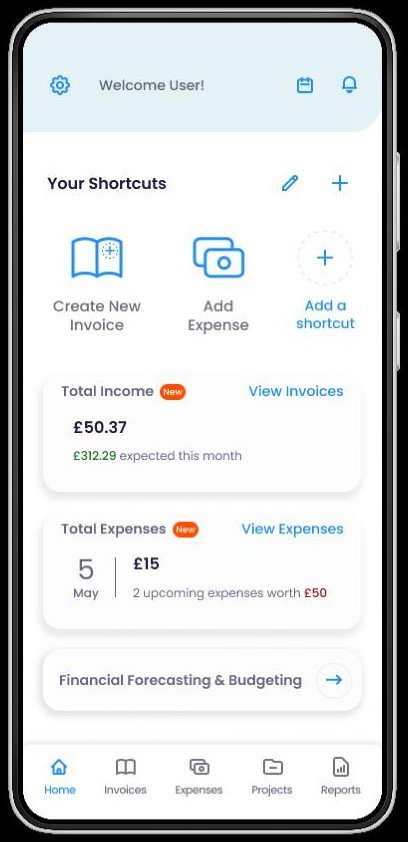
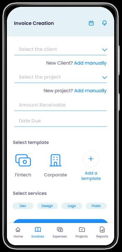
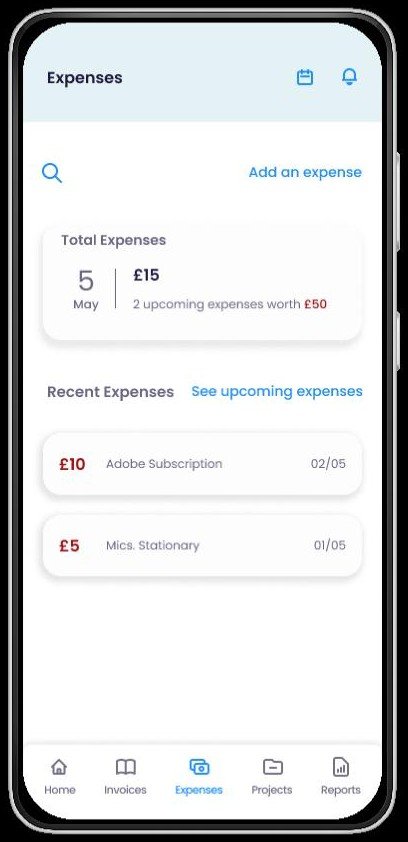
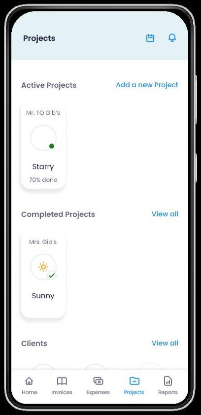
Screens captured from the 2024 Figma prototype that testers used. Names, projects and amounts are placeholders.
Round two: how it felt
I tested the hi-fi prototype with two participants using valence testing. They marked parts of the interface as positive or negative, and I linked each reaction to a need such as security, control or self-esteem.
| Element | Reaction | Testers | What it meant |
|---|---|---|---|
| Clean, modern dashboard | Positive | 2 of 2 | Felt in control, organised and competent |
| Integrated project tools | Positive | 2 of 2 | Felt organised, in control and secure |
| Invoicing process | Negative | 1 of 2 | Seen as complicated, time-consuming and inefficient |
| No customisation of invoices and reports | Negative | 1 of 2 | Felt impersonal, with no branding |
Overall, one tester was slightly positive and the other neutral. Neither commented on expense tracking, forecasting or client communication, so I learned nothing about those.
The invoicing complaint matters most. Invoicing was the problem I set out to fix, and one of two testers found it the slowest part.
The customisation complaint is a gap between my reasoning and my prototype: I had argued that personal branding mattered to freelancers, and one tester felt the prototype didn't offer it.
What this does and doesn't show
- Two testers in each round. The patterns are worth chasing, but each person is half of the evidence.
- It measures feeling, not performance. Valence testing tells me what people liked. I did not time tasks or count errors, so I can't say it saves time.
- Several features went untested. Expense tracking, forecasting and client communication got no reactions.
The next iteration
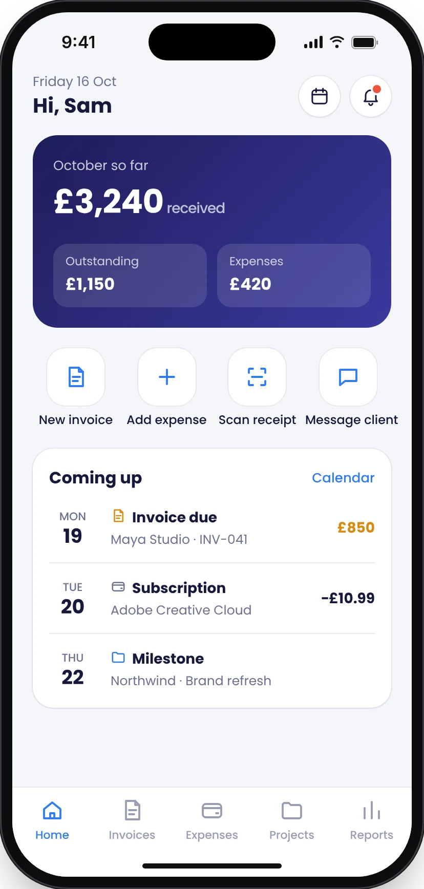
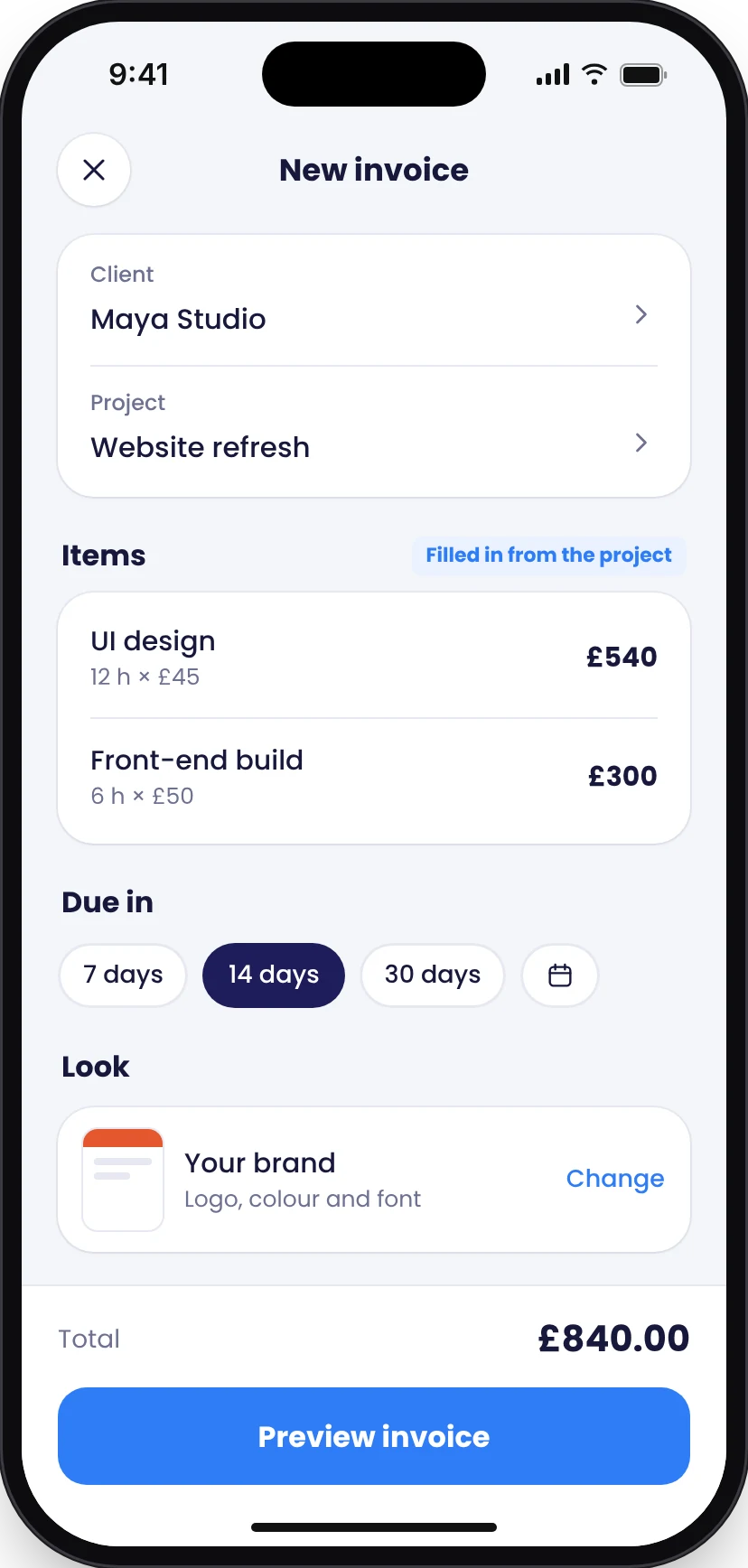
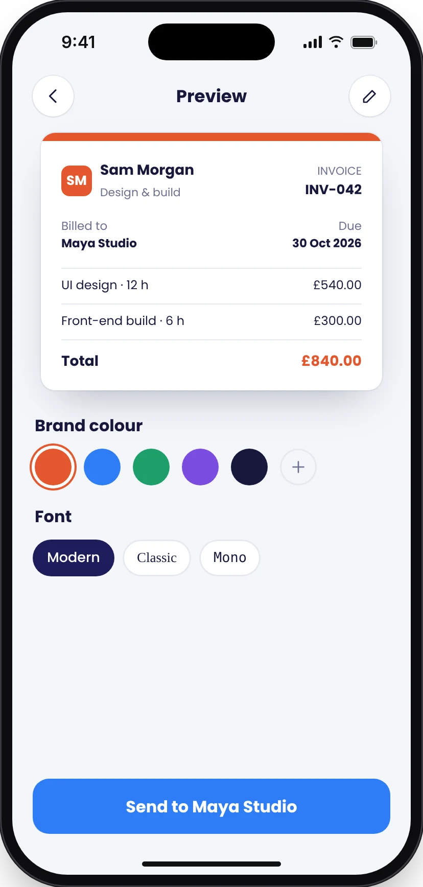
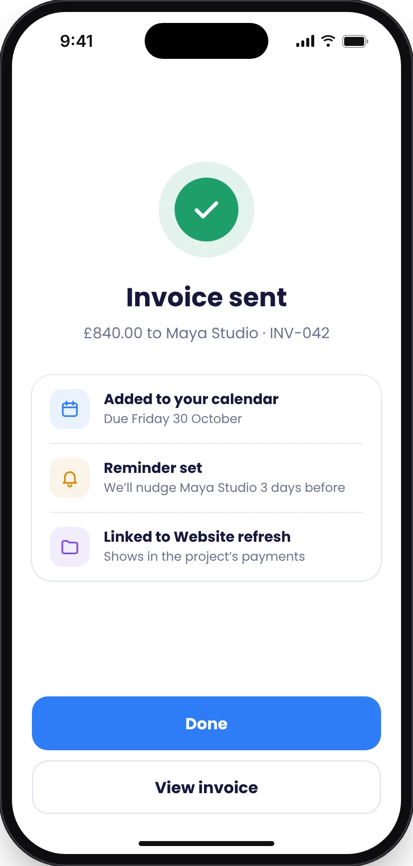
Looking back, the 2024 prototype had the right structure but the wrong weight in places: invoicing took too many steps, and the branding I had argued for was hard to see. I redesigned five screens around what the two rounds of testing showed. This redesign has not been tested with users, so treat it as my current thinking, not a result.
Invoicing in one screen
One tester found invoicing slow. Items now come from the project, and the due date is one tap, so a typical invoice is a review rather than a form.
Branding you can see
One tester missed customisation. Your logo, colour and font are now part of the invoice flow, with a live preview before sending.
Confirm what happened
Paper testers asked for reassurance after sending. The sent screen says what happens next: calendar, reminder and project link.
One list of what's due
Both paper testers wanted one calendar. Home now shows invoices, expenses and milestones due soon in a single list.
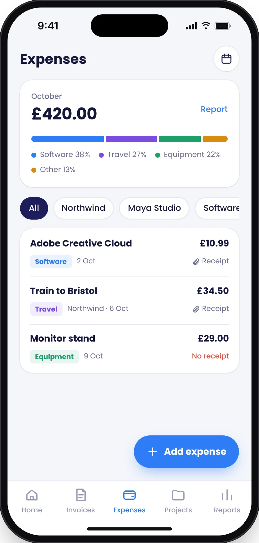
Expenses that explain themselves
Paper testers asked for tags, receipts and charts. Each expense shows its category, its project and whether the receipt is attached, under a monthly breakdown.
Still to do. Time the new invoice flow against the tools freelancers use today, check whether people find and use the branding options, and test with more freelancers on real tasks. Names, amounts and dates in these screens are placeholders.