Case study · AI · EdTech
LearnSwitch AI
An AI learning companion that turns textbooks, audio and video into the format each learner prefers, with an AI tutor that explains, quizzes and summarises. My MSc major project at Kingston University.
The problem
Learning material is locked into one format, and learning tools bury people in options and generic content.
What testing showed
All four testers struggled with the navigation, and one couldn't tell whether a control was for them or for the AI.
What I changed
A bottom navigation bar, a simpler menu, clearer labels on AI controls, in-place note editing and a clearer module layout.
Understanding how people learn
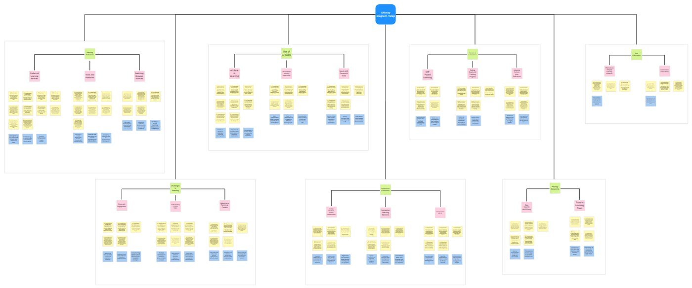
I started with user interviews and by watching people use learning tools they already knew, such as Quizlet and Coursera. Watching mattered: what people said they wanted and what they actually did were not always the same. I grouped everything I heard and saw into an affinity map.
What the research surfaced
- Overwhelmed by generic content. People spent time wading through material that wasn't relevant to them.
- They wanted to switch formats. Reading, listening and watching suited different moments, and most tools lock content into one.
- They wanted AI that adapts. Help that responds to their own progress and sticking points, not a fixed path.
- Too many choices. Existing tools offered so many options that getting started felt like work.
Who I designed for
I turned the research into empathy maps and three personas: Maria, a teacher; John, a project manager; and Sophia, a junior data scientist. Each had a journey map showing where today's tools let them down. POV statements and a 5 Whys exercise pushed past the surface complaints to the underlying needs.
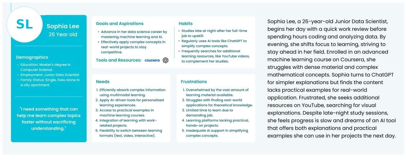
Ideas came from How Might We questions, rapid idea generation and a worst-idea session to rule out what would hurt the experience. I scored the ideas with a NUF test (new, useful, feasible). Two came out on top and became the core of the product: switching content between formats and a personalised AI tutor.
From paper to prototype
I sketched the core flows on paper first to get the structure right, then built a clickable high-fidelity prototype in Figma covering onboarding, upload, format conversion, the AI tutor, notes and history.
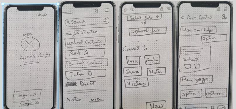
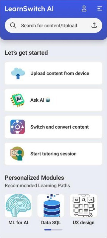
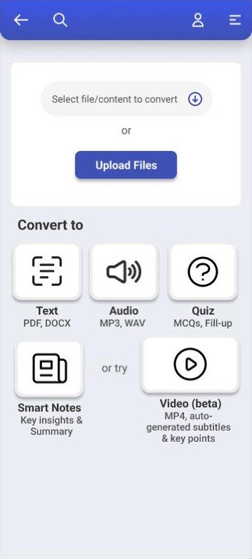
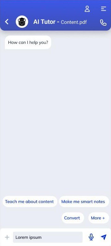
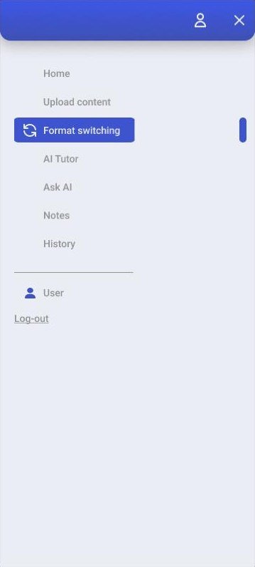
About these screens. This is the prototype as tested in 2024, built against a submission deadline. Visual polish wasn't the focus, and some content is placeholder. The point of this stage was to test the structure and the AI interactions.
Testing with valence markers
I tested the prototype with four participants using valence testing. They explored the app freely, thought aloud, and marked each part of the interface green (positive) or red (negative). This captures how each element made people feel, which matters for a product people should want to come back to.
| Element | Reaction | Testers | What it meant |
|---|---|---|---|
| Hamburger menu | Negative | 4 of 4 | Too many options in one place; broke the flow |
| Custom module element | Negative | 3 of 4 | Confusing hierarchy and layout on the home screen |
| Quick and smart notes | Negative | 2 of 4 | Visually bland and hard to reach directly |
| Highlight button | Negative | 1 of 4 | Unclear who it was for: the learner or the AI |
| Ask AI interface | Positive | 4 of 4 | Familiar and comfortable to use |
| Simple onboarding | Positive | 3 of 4 | Easy to start using the app |
| AI tutor adapting to the learner | Positive | 3 of 4 | Valued multimodal, adaptive learning |
Selected rows from the full valence table. Counts show how many of the four testers marked each element.
The finding I learned most from: one tester couldn't tell whether the highlight button was for them or for the AI.
In a normal app, a button belongs to the user. In an AI product, some actions are taken by the person and some by the model, and the interface has to make that obvious. A control that doesn't say who acts makes people hesitate, or trust the wrong thing. It's a small finding from one tester, but it points at a real problem in AI interfaces.
What I changed
Navigation moved to a bottom bar
Why
Every tester reacted negatively to the hamburger menu, and one asked for bottom navigation directly.
Change
A persistent bottom navigation bar for the main areas, and a menu trimmed to the options people actually needed.
Clearer labels on AI controls
Why
The highlight button didn't say whether it acted for the learner or triggered the AI.
Change
Relabelled the highlight button and other unclear controls so their purpose is obvious at a glance.
Notes you can edit where you read them
Why
Notes felt bland and hard to reach, and one tester wanted to edit them straight from the main screen.
Change
In-place note editing and a visual redesign of the quick notes section.
A clearer custom module layout
Why
Three of four testers found the custom module hierarchy confusing.
Change
Reorganised the module element and added short explanatory text.
What this does and doesn't show
- Four testers, fairly tech-confident. The findings point in a direction; they don't represent every learner.
- Valence testing measures reactions, not task success. I didn't measure completion rates or time on task.
- The changes weren't re-tested. They respond directly to the findings, but a second round would be needed to confirm they work.
- Feature overload was a real risk. Testers felt the home screen offered too much. Next time I'd launch with fewer features and reveal the rest gradually.
The core idea held up: testers valued being able to switch formats and an AI tutor that adapts to them. What got in the way was the interface around the AI, not the AI itself.
Revisited in 2026: an untested redesign
Looking back at the 2024 prototype, the structure held up but the visual design didn't. I redesigned five key screens with what the testing taught me. This redesign has not been tested with users, so treat it as my current thinking, not a result. The sample lesson content is written for the mock-ups.
One idea runs through all five screens: it should always be obvious what the AI produced and what you did yourself. AI content sits on a tinted surface with an "AI" tag. Your own content stays plain white. One accent colour is used for actions, and the main controls are at least 44px tall.
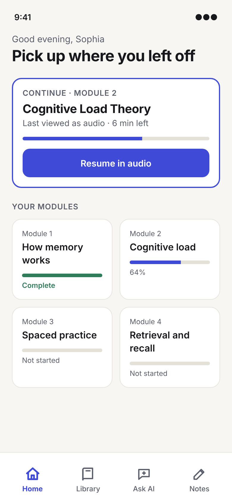
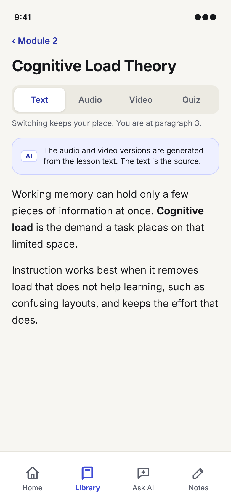
Bottom navigation instead of a hamburger menu
Testers struggled to find things behind the menu. Four always-visible destinations, within thumb reach, remove a search step.
Switch format in place
A single control at the top of the lesson, and your position carries over. A note says the text is the source and the other formats are AI-generated.
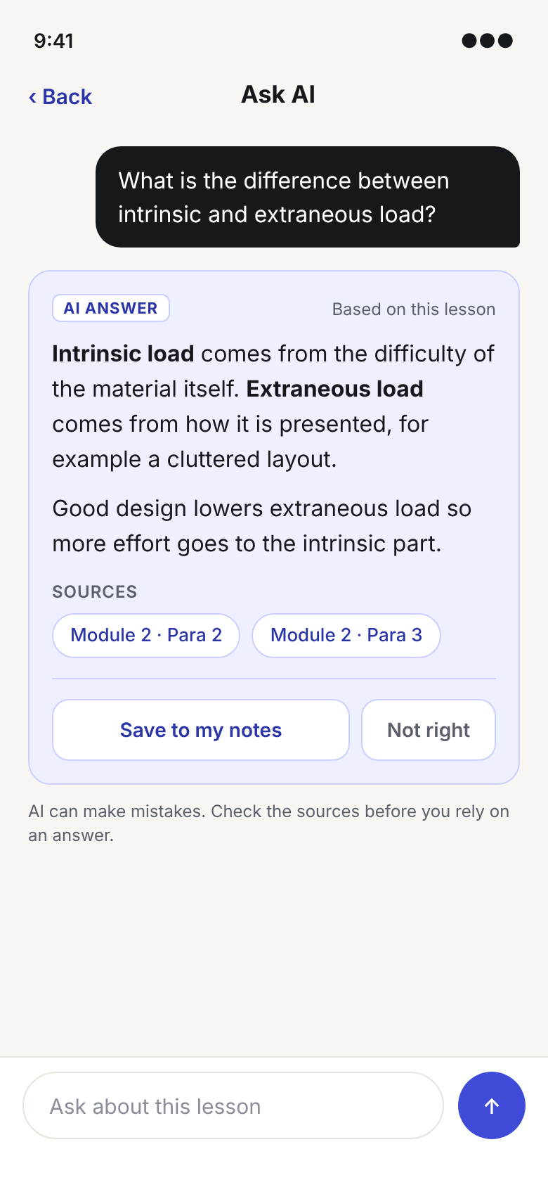
Answers show their sources
Chips link to the lesson paragraphs the answer is based on, so learners can check it. A short reminder says AI can be wrong.
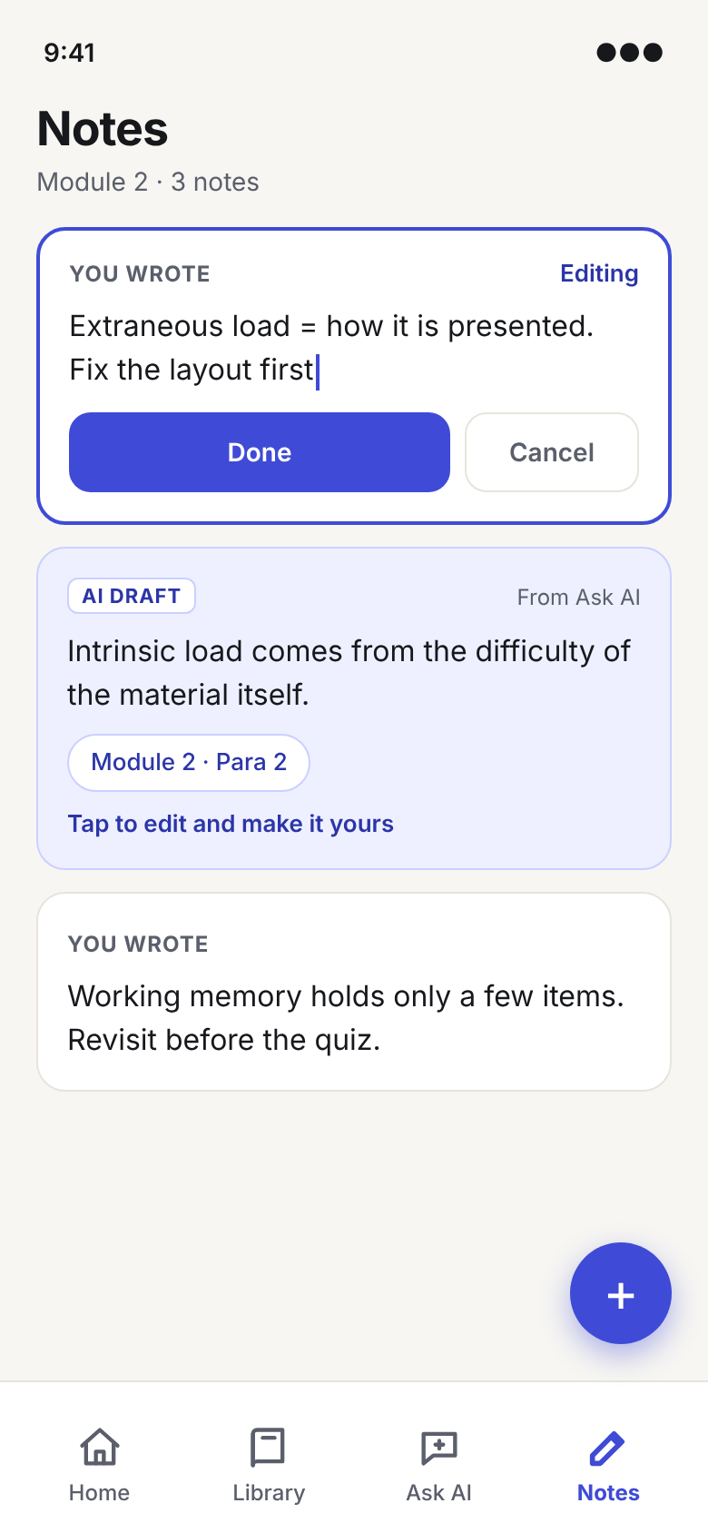
Edit notes where they are
AI drafts are tagged and invite editing, so the learner turns them into their own words.
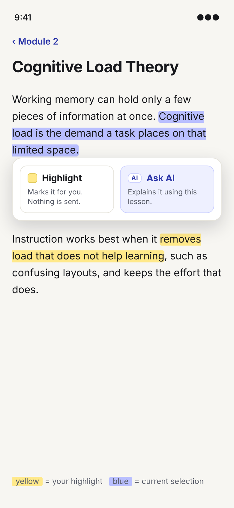
Say what each control does
Highlight and Ask AI look different and each says what happens: one marks for you, the other asks the AI.
Still to do. Test these with learners, especially whether the source chips are noticed and used, and whether the AI tag is enough to tell the two kinds of content apart.