Case study · Usability research · Web and mobile
A usability study of SpareRoom
Four people, three tasks and two devices: where SpareRoom's room search, ad posting and Where to Live Wizard slowed people down, and what I recommended changing. MSc coursework at Kingston University.
The question
Can people find a room, post an ad and use the Where to Live Wizard quickly and easily, and does it differ on mobile?
What I found
Too many filter options, unclear room information, a long ad form and hard-to-find features. Average SUS was about 31 on both devices.
What I recommended
Ten changes, led by simpler filters, a shorter ad form with clearer labels, and features that are easier to find. None of them was tested.
An independent study. This was a university project. I am not affiliated with SpareRoom, they did not commission it, and I have not tested my recommendations. With four participants, the findings point to problems worth investigating. They are not a verdict on the product.
Why SpareRoom
SpareRoom connects people who want shared housing with people who have a room to let. It is used by students and young professionals, often on a phone, often in a hurry, and the stakes of choosing badly are high: a home. Three things made it a good subject: a search with many filters, an ad-posting flow with many fields, and a feature (the Where to Live Wizard) that asks people to describe their preferences instead of picking a location.
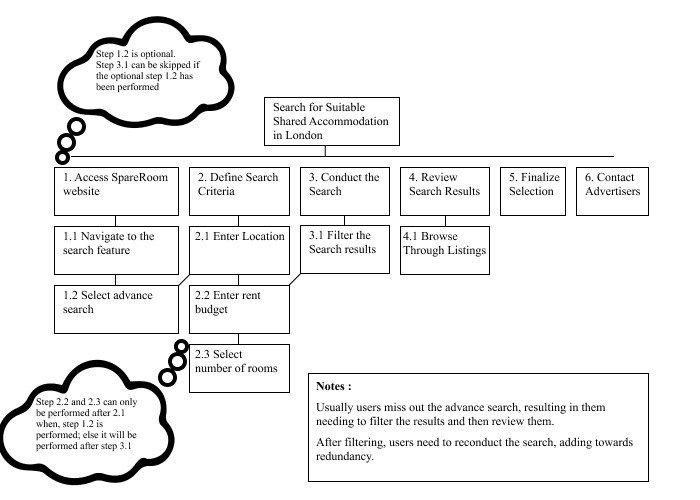
I started with the search task, mapping how someone looks for shared accommodation in Hampstead today.
How I tested
I used the Common Industry Format (CIF), a standard structure for reporting usability tests, with a repeated-measures design: every participant did the same three tasks on a desktop and on a phone, with devices provided by the moderator. Two participants started on desktop and two on mobile, to spread out the effect of doing the tasks twice. Sessions were in person, in the participant's room or a common room.
| Task | What participants did | What it tests |
|---|---|---|
| 1. Search for rooms | Find suitable rooms and understand the details and rent | The core job of the site |
| 2. Post an ad | Create a listing for a flatmate in Surrey | Effort and clarity of the listing flow |
| 3. Where to Live Wizard | Express locality preferences and make an informed choice | Whether the feature is easy to find and understand |
I recorded task success, errors, assists and time on task, and each participant completed the System Usability Scale (SUS) for each device.
The participants
Four students aged 21 to 28 (three women, one man), recruited through social media and student forums. Two had used SpareRoom before and two had not. All four were comfortable with technology, so they do not represent older users or people with accessibility needs.
What happened
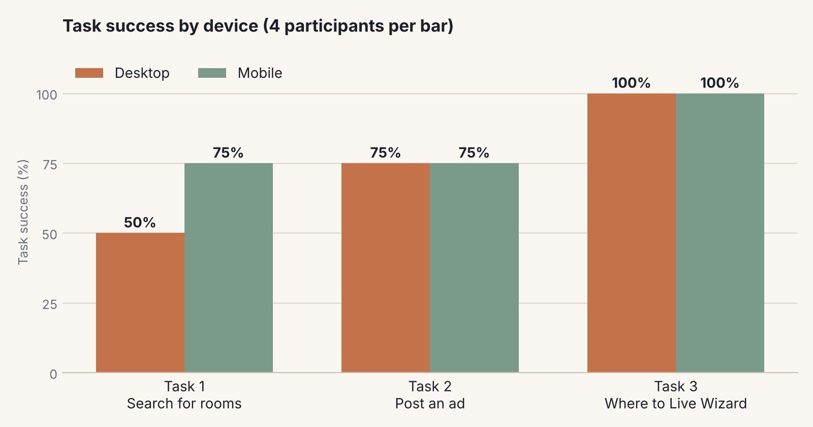
The core task, searching for a room, was the one that failed most on desktop. Two of four participants did not complete it there. On mobile, three of four did, though they needed more help. The ad-posting task was where time went: on mobile, two participants took over ten minutes.
| Task | Device | Success | Avg. errors | Avg. assists |
|---|---|---|---|---|
| 1. Search | Desktop | 2 of 4 | 0.5 | 0.75 |
| 1. Search | Mobile | 3 of 4 | 0.25 | 1.25 |
| 2. Post an ad | Desktop | 3 of 4 | 0.5 | 0.25 |
| 2. Post an ad | Mobile | 3 of 4 | 0.75 | 0.5 |
| 3. Wizard | Desktop | 4 of 4 | 0.5 | 0.25 |
| 3. Wizard | Mobile | 4 of 4 | 0 | 0.25 |
An "assist" is a moment when the moderator had to help. Averages are over four participants.
Satisfaction was low on both devices
SUS scores run from 0 to 100, and the commonly cited average is around 68 (an outside benchmark, not from my study). Average scores here were 31.88 on desktop and 30 on mobile. One participant scored the mobile site just 2.5. With four people I treat this as a signal that satisfaction was poor, not as a precise measurement.
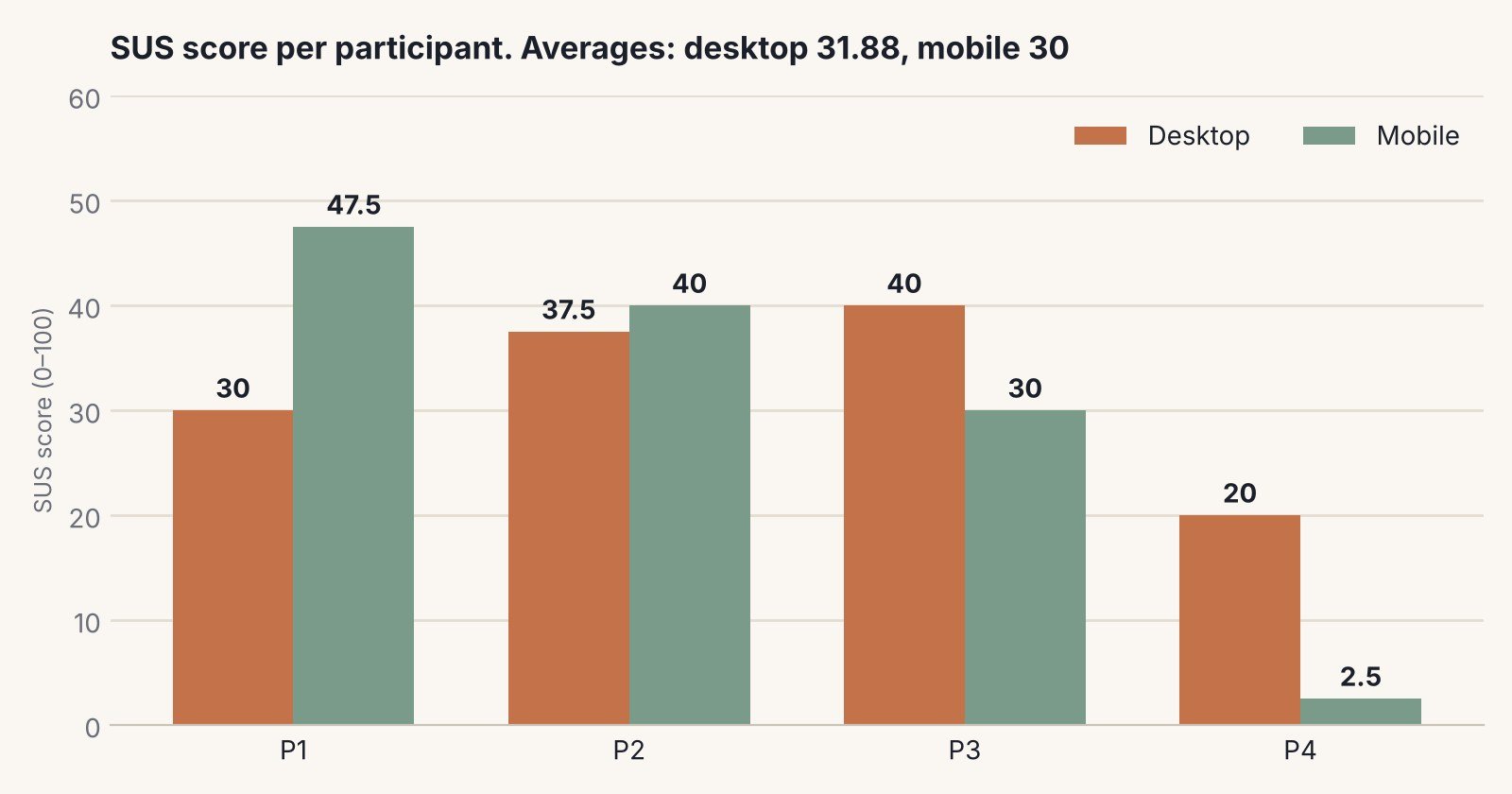
Mobile was not simply better or worse. It helped in the search and hurt in the ad form.
Search success was higher on mobile (75% against 50%) and errors were lower, but participants asked for help more often. Posting an ad was slower on mobile, where a long form and prominent paid "bold ad" upsells competed for attention.
What got in people's way
From the sessions I logged ten issues and gave each a High, Medium or Low priority. Five were High.
Too many filter options
What I saw
People struggled to process the volume of filters and advanced options, which slowed their decisions. High priority.
Recommendation
Group the options into categories and reveal detail progressively.
Unclear order of actions
What I saw
People were unsure what to do next, which disrupted the flow of the task. High priority.
Recommendation
Restructure around a logical flow, with clear headings and breadcrumbs.
A long ad form with unclear labels
What I saw
Too many fields, and labels that did not make clear what was wanted. Both High priority, and likely reasons posting an ad took so long.
Recommendation
Cut non-essential fields, use sensible defaults, and write more descriptive labels with tooltips.
Hard-to-find features in the Wizard
What I saw
Everyone completed the task, but people found the layout puzzling and the results heavy on data. High priority.
Recommendation
Place features where people expect them and add visual cues such as icons or colour.
Unclear room details and mixed rent periods
What I saw
Room information was unclear in results and listings, and switching between weekly and monthly rent confused people. Both Medium priority.
Recommendation
Use a structured layout with visual cues for key details, and one rent format with a weekly/monthly toggle.
Ads, personal details and long descriptions
What I saw
Bold-ad promotion felt overwhelming (Low priority), the amount of personal detail requested made people uncomfortable, and long descriptions caused confusion (both Medium).
Recommendation
Give ads less weight, ask for less personal data and explain why each item is needed, and give short instructions with examples.
Some of these cards group more than one of the ten issues in my report. The recommendations are grounded in standard usability principles such as reducing cognitive load and keeping labels clear. I have not tested whether they work.
I also ran the WAVE accessibility tool on a Hampstead results page. It flagged 9 errors, 68 contrast errors and 76 alerts. That was one page and one automated check, so it is a starting point for an audit, not a full assessment.
Turning the findings into a prototype
As a separate deliverable on the same module, I redesigned the search as an interactive wireframe in Figma, for desktop and mobile. The aim was to fix the problem the task analysis had shown: people missed the advanced search, filtered afterwards and had to start again. In the prototype the key filters (location, number of rooms and budget) sit in the search bar itself, and rent can be switched between weekly and monthly.
I am not showing screens here. The prototype copies SpareRoom's branding and layout closely, which is fine for coursework but not something I want to publish as my own design work. Its documentation sets out research questions for a feedback session. This page does not report results from one, and I make no claim that the prototype performs better than the current site.
Limits, and what I would do differently
- Four participants. They were all students and comfortable with technology. I would recruit more, and include older users and people with accessibility needs.
- Three tasks. They did not cover everything people do on the site, so there are likely issues I did not see.
- Prior experience. Two participants had used SpareRoom before, which may have affected their results.
- A data inconsistency. My report's summary row for Task 3 on desktop lists a mean of 0.75, but all four participants passed. The chart above shows 100%, from the individual results.
- No test of the fixes. The honest next step is to test the redesigned search with new participants against the current site, using the same tasks and measures.