Case study · Lean UX · AI concept · Mobile
Travel Tarot
A concept for an AI-assisted trip planner for solo travellers, where you draw tarot cards to get destination ideas. I took it from assumptions to a clickable prototype and tested it with five people. MSc coursework at Kingston University.
The idea
Trip planning is tedious and generic. What if drawing cards made choosing a destination playful, with AI suggestions behind it?
What testing showed
All five testers finished five tasks in under 4 minutes 10 seconds. Two asked for a deeper onboarding.
What it doesn't show
That the AI suggestions are good, or that people would keep using it. The prototype is scripted and the test was short.
A concept, not a product. This was a university project with a clickable prototype. No AI model was built, so the destinations and itinerary you see are placeholders. The images are placeholder artwork.
Starting from assumptions
The brief was to explore an emerging technology with Lean UX, a method that starts by writing down what you believe and then tests the riskiest beliefs early. My belief: solo travellers find planning time-consuming and generic, and might enjoy a more playful, surprising way to get ideas.
I wrote two proto-personas, Alex, who wants surprise and hidden gems, and Taylor, who wants an efficient plan. Proto-personas are assumptions, not findings, so I treated them as things to check. I then asked five people aged 18 to 27, including a freelance designer, a tech worker, a student, a photographer and a digital nomad, how they plan trips.
What the five said
- Planning is a chore. Their challenges were time-consuming research, lack of personalisation, lack of unique destinations, too many options and unreliable information.
- They liked the idea. All five said yes when asked about AI recommendations, gamified elements and the Travel Tarot concept.
- Usability and personalisation mattered. Four of five rated each as highly important.
How far to trust this. Five people, shown a concept, saying they like it is weak evidence. It tells me the idea was not obviously wrong, not that people would use it.
Turning beliefs into hypotheses
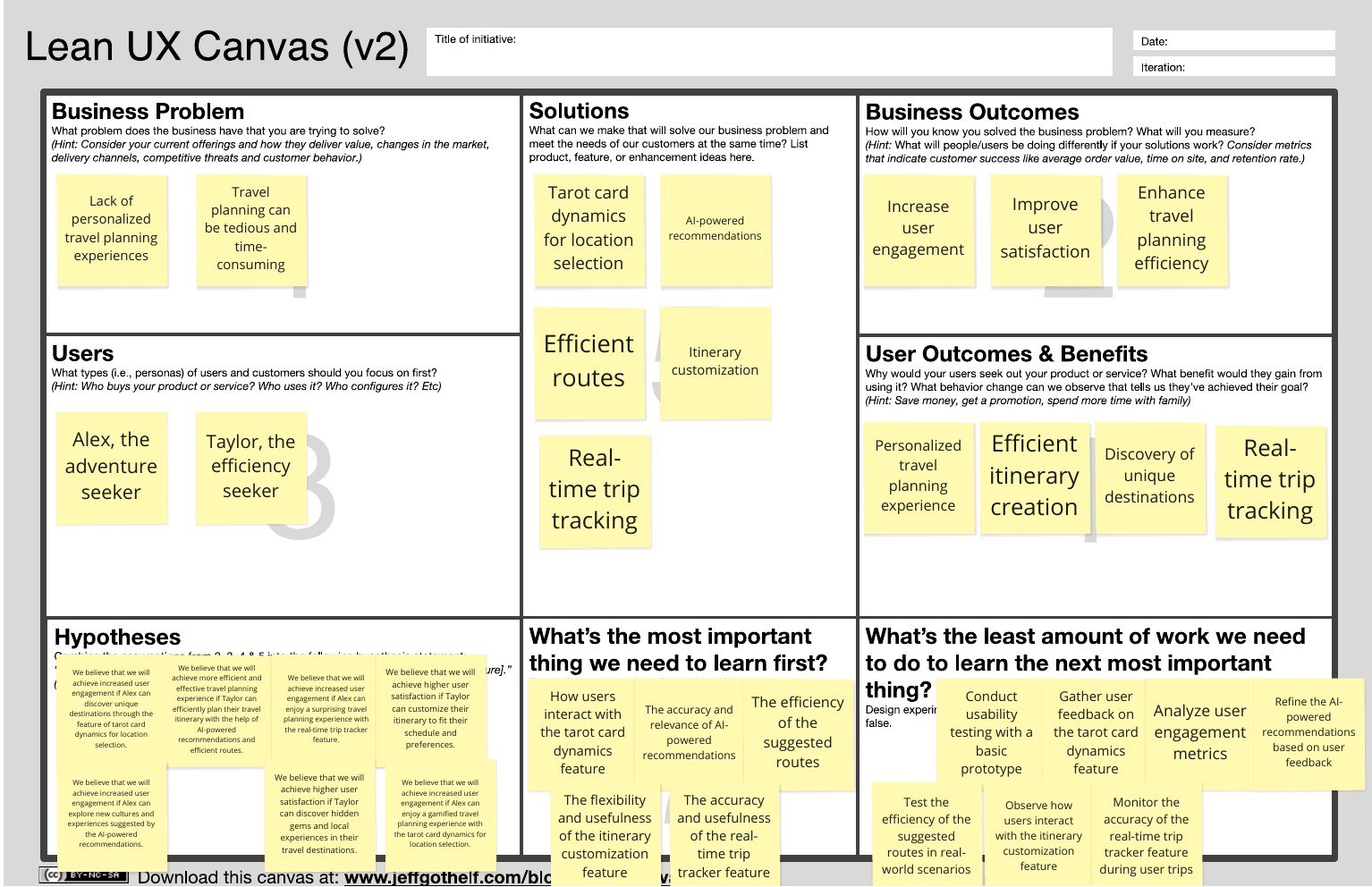
I listed business and user assumptions and ranked each by how likely it was and how much it would hurt if wrong. The risky ones became hypotheses on a Lean UX Canvas, for example: we believe Alex will find the experience engaging if they can discover destinations through tarot-card dynamics. Seven hypotheses came out, each tied to a feature: tarot-card selection, AI recommendations with efficient routes, itinerary customisation and a real-time trip tracker.
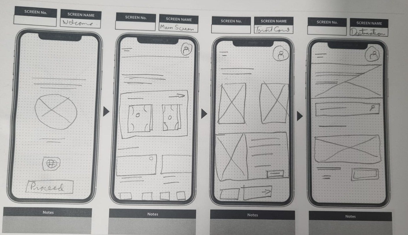
A card-sorting exercise on the app's pages helped me decide what mattered most on each screen. Then I sketched the core screens on paper before building anything.
The prototype
I built a clickable prototype in Figma. You draw two tarot cards, tap to reveal them, get suggested destinations, save one, and open an itinerary you can edit.
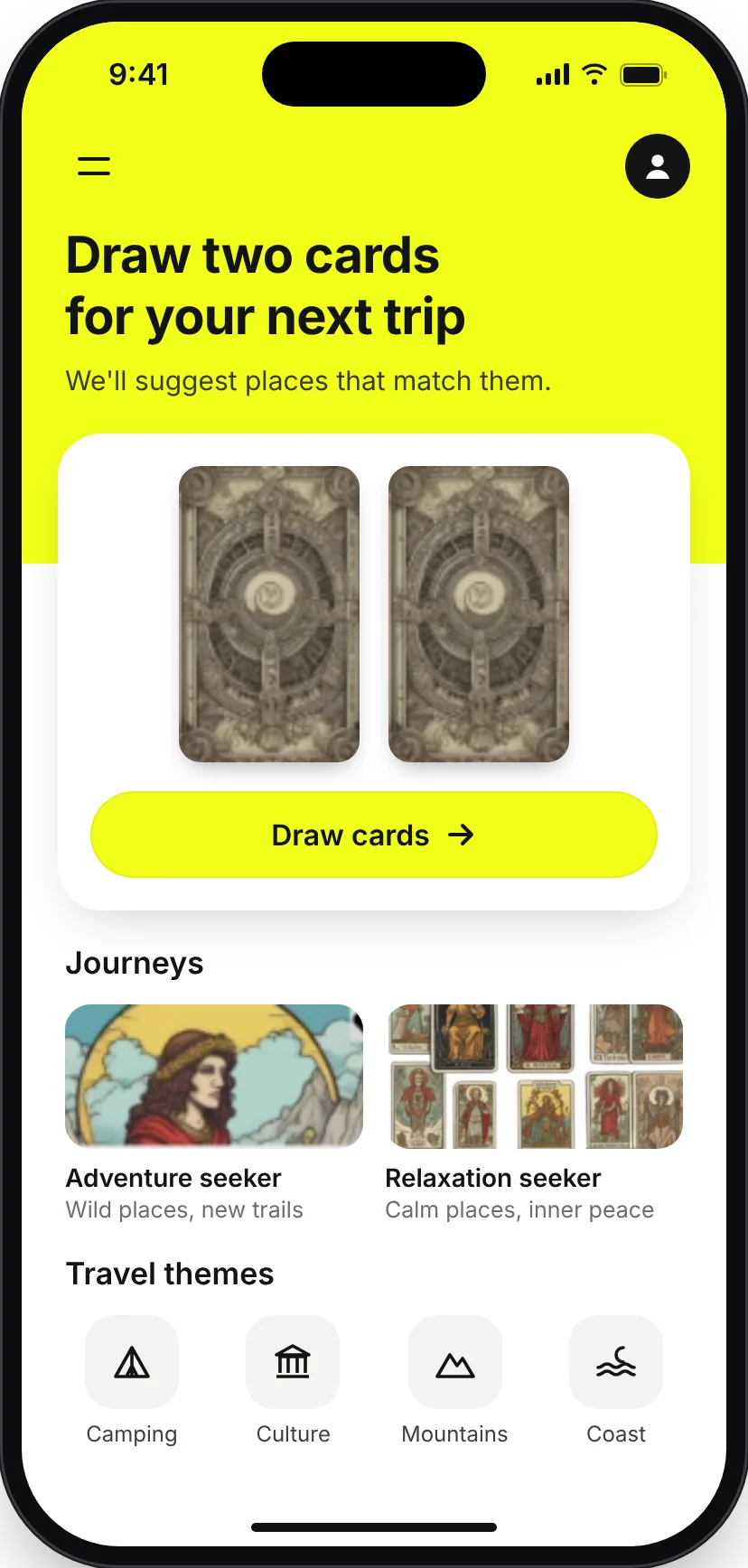
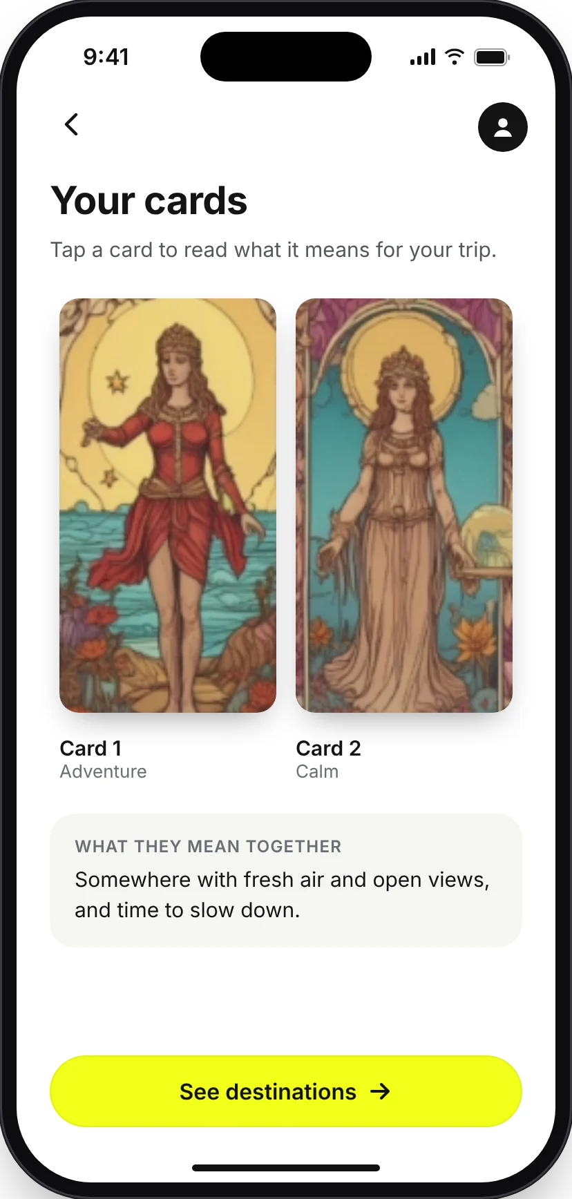
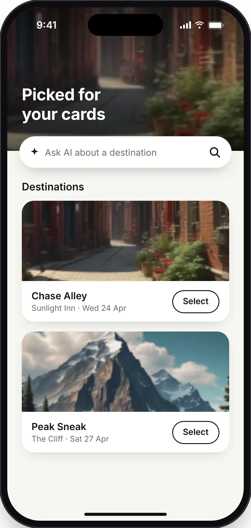
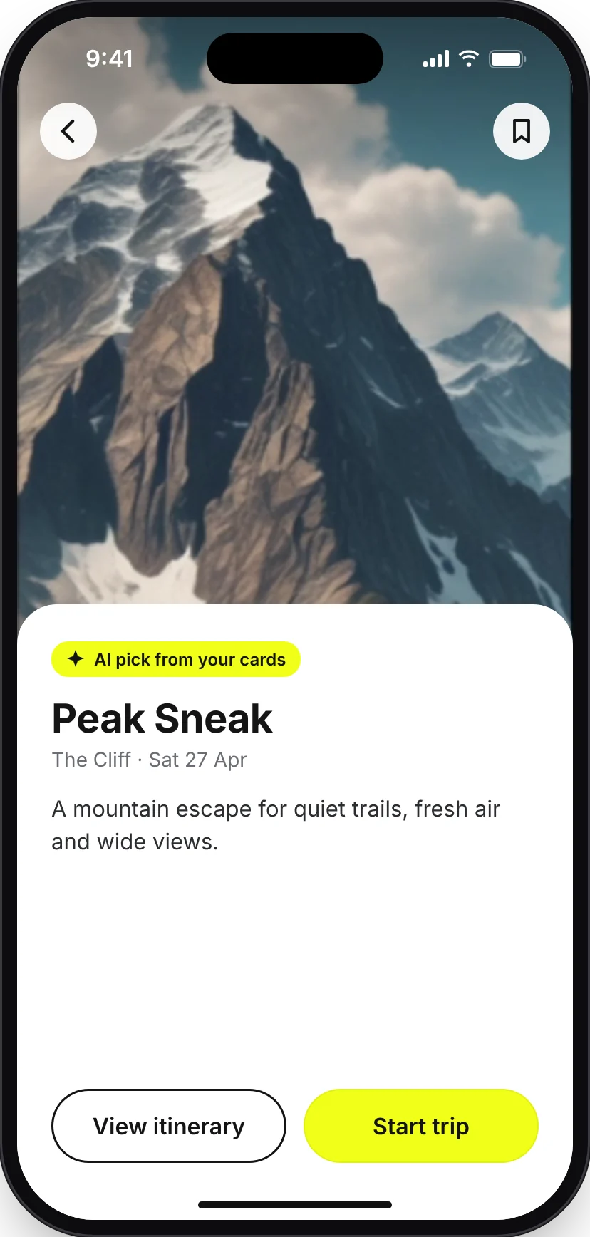
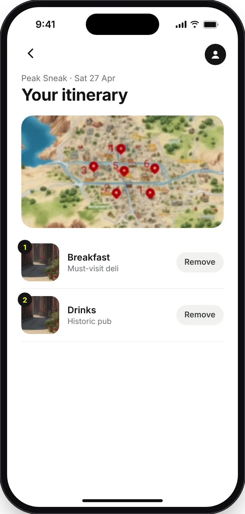
About these screens. These are tidied versions of the prototype I tested in 2024. The flow and layouts are the same, but I cleaned up the copy and spacing and made the AI label clearer. Testers saw the original, rougher screens. The artwork and photos are placeholders, and the destinations are fixed content, not generated.
Testing with five people
I ran a think-aloud usability test with five participants. Each did the same five tasks from a script: go through onboarding, draw tarot cards, view the suggested destination, select and save "Peak sneak", and remove the pub from its itinerary. My target was to finish all five tasks within six minutes.
| Participant | Time (all 5 tasks) | Errors | Assists | What they said |
|---|---|---|---|---|
| P1 | 4:00 | 0 | 0 | "Looks good" |
| P2 | 4:10 | 1 | 0 | No comment recorded |
| P3 | 4:00 | 0 | 0 | "Simple and easy to understand" |
| P4 | 3:30 | 0 | 2 | Wanted a deeper onboarding, suggested a demo |
| P5 | 4:00 | 0 | 0 | Wanted a deeper onboarding |
An "assist" is a moment when I had to help the participant.
Two of five asked for a deeper onboarding. That is the one change the testing clearly supports.
The tarot-card idea is unfamiliar, so people needed to understand what it does before they could enjoy it. I would add a short interactive walkthrough, or a demo as one participant suggested, before the first draw.
How I read the results now
In my report I scored the hypotheses against the test: five validated, one partly and one not, which came to 78.57%. Looking back, I would not call that validation. A short, scripted test can show that people could complete the tasks. It cannot show engagement, satisfaction or that suggestions are useful.
What the test supports
The core flow of drawing cards, picking a destination and editing an itinerary was easy to complete. Two people wanted more help at the start.
What it can't show
Whether the AI suggestions are good (they were scripted), whether tarot dynamics keep people engaged over time, or whether people would use it for a real trip.
What came out weakest
The real-time trip tracker was only partly supported, and the hypothesis about finding hidden gems and local experiences was not supported at all.
Not tested at all
The metacognitive idea, helping people see how they make planning decisions, never reached the test.
What I would do next
- Fix the onboarding with an interactive walkthrough, then retest it.
- Test the AI part properly. Use a wizard-of-Oz setup, where a person generates the suggestions, to see whether people trust and act on them.
- Test with more, and more varied, people over a real trip-planning task, not a scripted path.
- Make "what the AI is doing" visible, so people know why a destination was suggested.