Case study · AI · Product design
Discern: checking before you rely
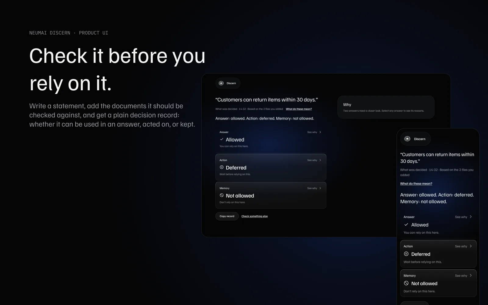
Discern is NEUMAI's first AI product. It helps people decide whether something is fit to rely on before they repeat it, act on it or keep it. I redesigned it from the people who would use it rather than from the system behind it.
The problem
The first version spoke the system's language. Trying it myself, I got three answers I couldn't read and couldn't tell what it was for.
What I made
Research, design rules, a full interface on desktop and phone, its design system, and the working front end.
What it doesn't show
Discern is in internal evaluation, not released. I haven't tested it with real users yet. The screens use sample content.
What's left out, on purpose. How Discern reaches its decisions belongs to NEUMAI and isn't shown here. This page covers the design: the people, the decisions, the interface and the system behind it.
Three plain answers
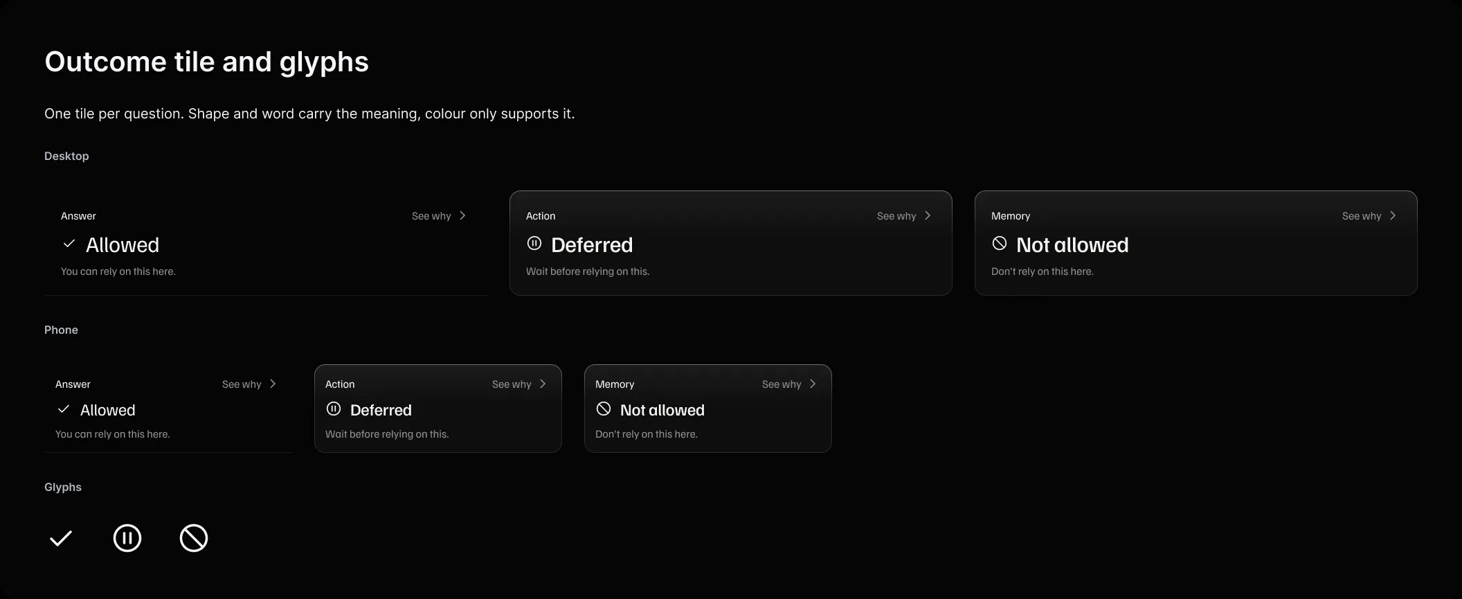
The person writes what they want to rely on and adds the documents it should be checked against. Discern answers three separate questions: can this be used in an answer, can it be acted on, and can it be kept.
Start from the people, not the engine
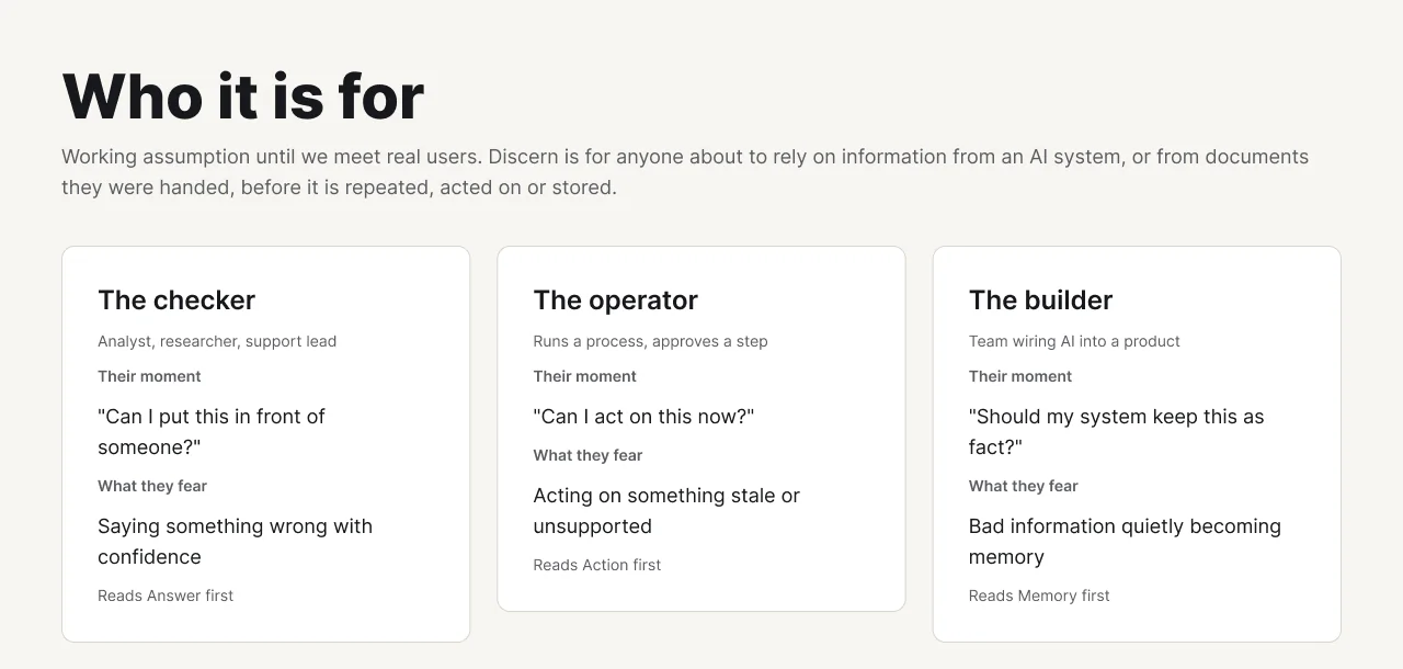
None of them came to learn new vocabulary. They came with something to check and some material, and they want to leave knowing what they can do. Until we meet real users, these three are a working assumption, each reading a different answer first.
Each need became a design rule, and each rule points to the screen where it lives. If a rule had nowhere to live, the design wasn't done.
| What people need | The rule it became |
|---|---|
| Start without setup or training | One screen, one obvious place to type, files dropped anywhere. No onboarding tour. |
| Know in seconds what they can do | The result leads with three plain answers, always the same three, in the same order. |
| See what needs attention | Shown by words and shape, never by colour alone. |
| Never confuse "no" with "couldn't check" | A missing decision looks and reads nothing like a negative one. |
| Trust it without blind faith | Reasons are one step away and never forced open. |
| Recover without losing work | Errors keep the statement and files. Retry is one press. |
One page, one flow: arrive, ask, add material, check, read, understand, leave. At each step the person has one question, and the screen answers only that.
| Step | What the person is thinking | What the screen does |
|---|---|---|
| 1 · Arrive | "Where do I start?" | The statement field is already focused. Nothing else competes. |
| 2 · Ask | "What do I want to check?" | Accepts plain language. |
| 3 · Add material | "Here's what it's based on." | Drop anywhere or browse. Files appear at once with their state. |
| 4 · Check | "Is it working?" | One calm status line, a way to cancel, honest waiting. |
| 5 · Read | "So what can I do?" | Three plain answers; what needs attention stands out. |
| 6 · Understand | "Why?" | Reasons one step away, for each answer. |
| 7 · Leave | "Done, or again." | Copy the record, or start a new check with one press. |
Three principles changed real decisions. Hick's law gave each moment one primary action, so the record has no main button at all. The Von Restorff effect made what needs attention the only thing that looks different. And error prevention, one of Nielsen's heuristics, is why "Check this" never greys out: it says exactly what's missing instead.
Four decisions that shaped it
A statement, not a question
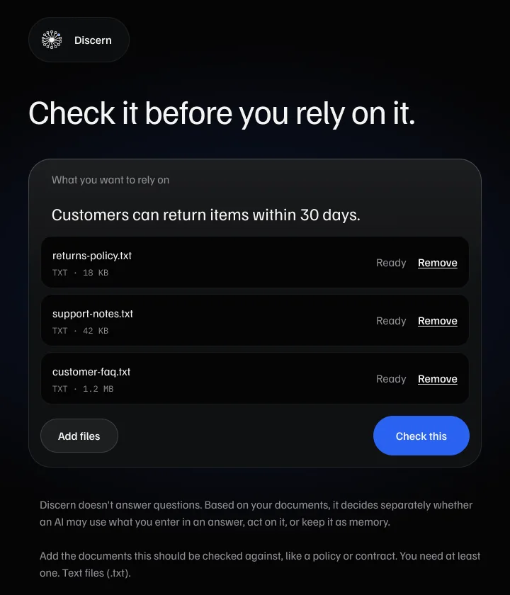
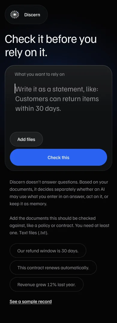
Discern doesn't answer questions. It decides whether something may be relied on. Asking for a statement ("Customers can return items within 30 days") made the three answers make sense.
Read aloud before the details
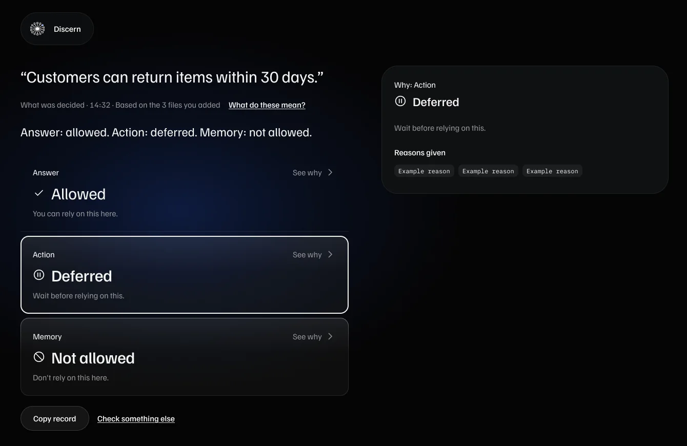
One plain line comes before the three tiles: "Answer: allowed. Action: deferred. Memory: not allowed." It says nothing the tiles don't, so the result reads in five seconds.
Never colour alone
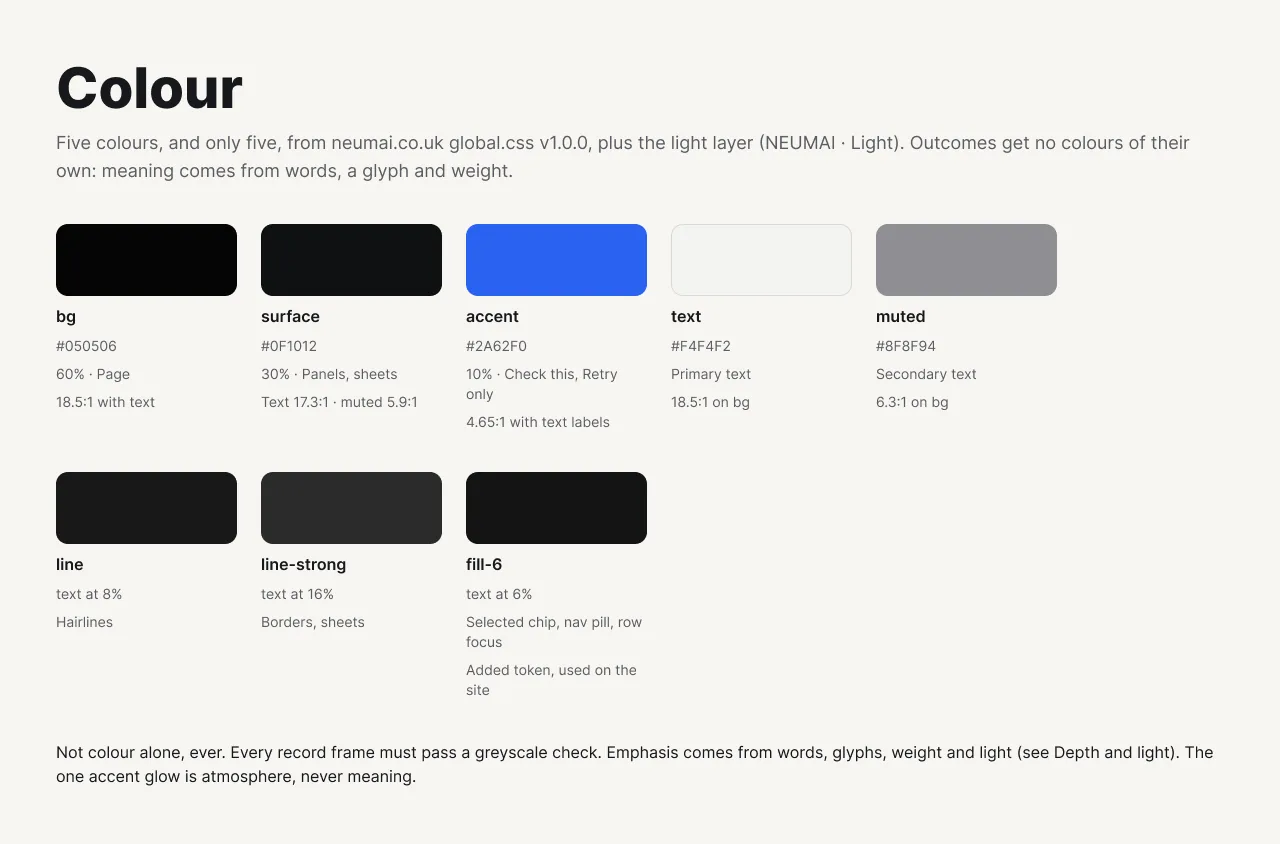
Outcomes have no colours of their own. A word, a glyph and weight carry the meaning, and every record passes a greyscale check.
The interface never invents a verdict
The screen shows only what was actually decided and adds no reasons of its own. If a result arrives that it can't read, it says so rather than guessing.
The flow
Ask
One screen, one obvious place to type, files dropped anywhere. If something is missing, the screen says exactly what, next to where to fix it.
Read, then understand
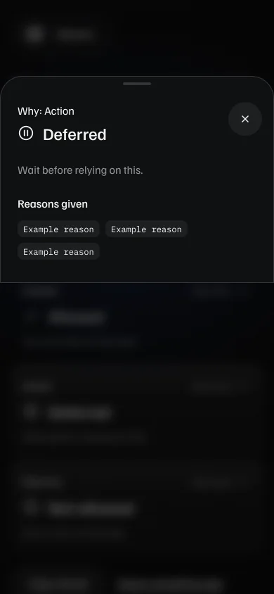
Reasons are one step away and never forced open. On desktop they fill the right-hand column; on phones they open in a bottom sheet.
No decision is not a no
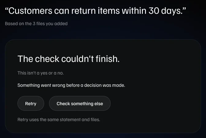
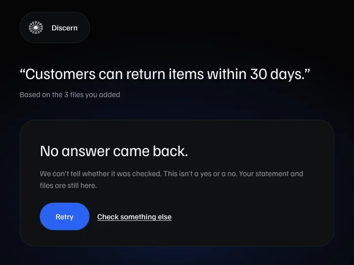
A check that couldn't finish must never look like a negative answer. These screens say "This isn't a yes or a no", keep the statement and files, and make retrying one press.
A design system that belongs to the brand
Discern couldn't be the odd one out, so it uses the website's five colours, type and spacing. What I added is light: depth comes from a lit edge, never from shadows, and only what needs attention is raised.
Accessible by construction
- Each answer tile is one button with a pressed state. The reasons column announces changes politely, without moving focus.
- Nothing is selected on arrival, and keyboard order follows reading order.
- On phones the bottom sheet traps focus, and Escape returns to the tile.
- Every control is at least 44 pixels. Text meets at least 16.6:1 contrast and muted text at least 5.7:1, even over the glow.
From Figma to a working front end
I took the design into code myself, in React and TypeScript, with AI assistance. Every state was checked against the design: phones, errors, timeouts, files that are too long, and a check that can't finish. Discern is now in internal evaluation.
What I've tested, and what I haven't
I haven't run real-user sessions yet. As a Lean UX pre-flight, I ran the flow past five personas. That caught copy, flow and jobs-to-be-done gaps cheaply. It can't replace real people, and I don't treat it as evidence.
The first real round is planned with five people. It works if:
- at least 4 of 5 state all three answers correctly after seeing the result for five seconds;
- at least 4 of 5 say a check that couldn't finish is not a "no";
- everyone finds the reasons in under ten seconds.
What I took from it
- The engine's words are not the product's words. The system needs precise terms to work. People don't, and the first version failed the moment it showed them. Translating at the edge, without changing what was decided, was most of the design.
- "Couldn't check" deserves as much design as "no". The failure screens took longer than the result screen. A tool for deciding what to trust loses that trust the first time a timeout looks like a verdict.
- Leaving things out is a design decision too. Showing less of how it works made the page and the product easier to read, and kept what belongs to NEUMAI where it belongs.
The brand and website it sits in have their own case study: NEUMAI: brand and website →