Case study · AI · Brand and web design
NEUMAI: brand and website
NEUMAI is an early-stage AI company in London. I refreshed its identity, built a design system from it, and designed and built the website that went live at neumai.co.uk.
The problem
A deep-tech company with a strong idea and no visual voice. Its site had to leave an impression and explain itself without much reading.
What I made
A polished mark, a five-colour design system, a component library and a live website, built and launched by me.
What it doesn't show
Traffic and conversion numbers. The site is new, and I'd rather show none than show a guess.
A website that has to impress
NEUMAI is a technology company trying to break into the AI space, not a media company. So the site couldn't just be calm and editorial. It had to leave an impression, and people had to get what NEUMAI is about without reading much. The text is there for those who want it.
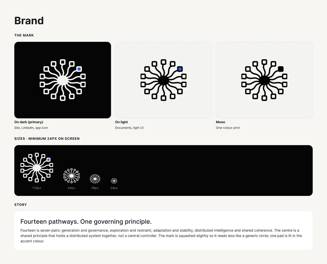
Keep the mark, make its oddness deliberate
I kept NEUMAI's original fourteen-pathway mark and rebuilt it: one gentle curve rotated fourteen times, square pads and one line weight. One pad is lit in the accent blue. At the founder's request I squashed it slightly. A perfect circle read as a generic badge; the squashed shape reads more like a brain. I drew it in three versions and checked it down to 24 pixels.
The story I wrote for it: Fourteen pathways. One governing principle. Fourteen is seven pairs, such as exploration and restraint. The centre holds a distributed system together; it isn't a central controller.
What I tried and dropped
- A marble orb as the hero. It read as cold, and it didn't land with the founder. Gone.
- A 3D glass glow. It looked like a generic, 2020-era cybersecurity site. Gone.
- A drag-to-core game in the hero. It confused people more than it explained anything. Gone.
- A big word-by-word scroll animation. Too large and janky. Gone.
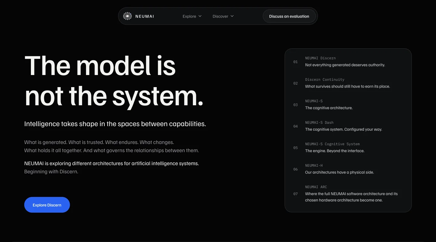
What stayed: a dark ground with one cobalt accent, a liquid-glass navigation, one left edge for every block of text, and no placeholder art. No graphic is better than an obvious stand-in.
A small system, used strictly
Five colours and no more: a near-black ground, one surface, one cobalt accent kept for actions, and two text greys. Hairlines aren't a sixth colour; they're the text colour at low opacity. Familjen Grotesk for reading, IBM Plex Mono only where precision is the point. Every gap is on an 8-point scale, and nested corners follow one rule: outer radius equals inner radius plus padding.
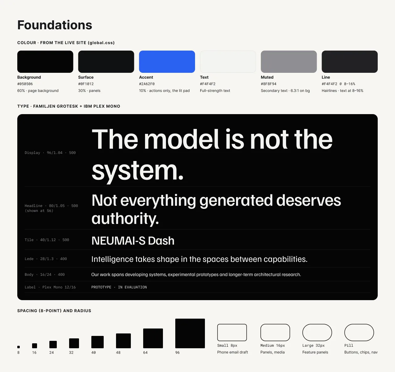
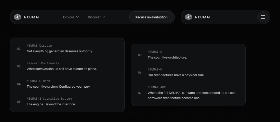
I documented every component with its states, so the build had one answer for each. Buttons have one primary style for the single main action in a section; the navigation shows which menu is open by keeping its pill raised.

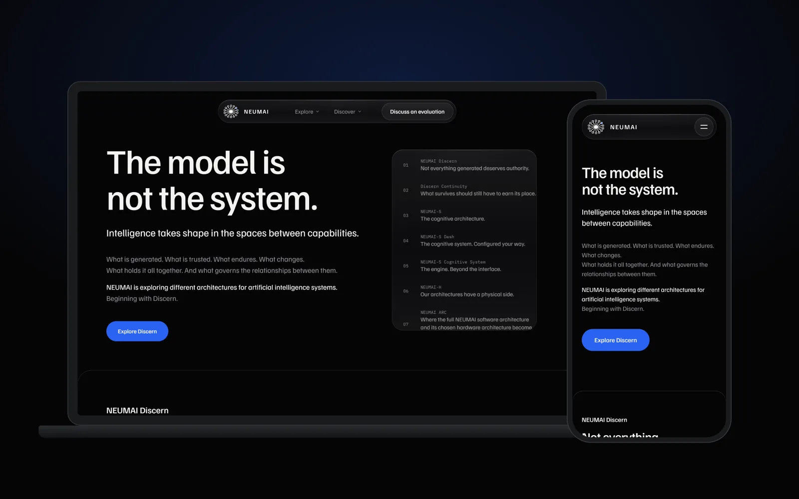
Screens
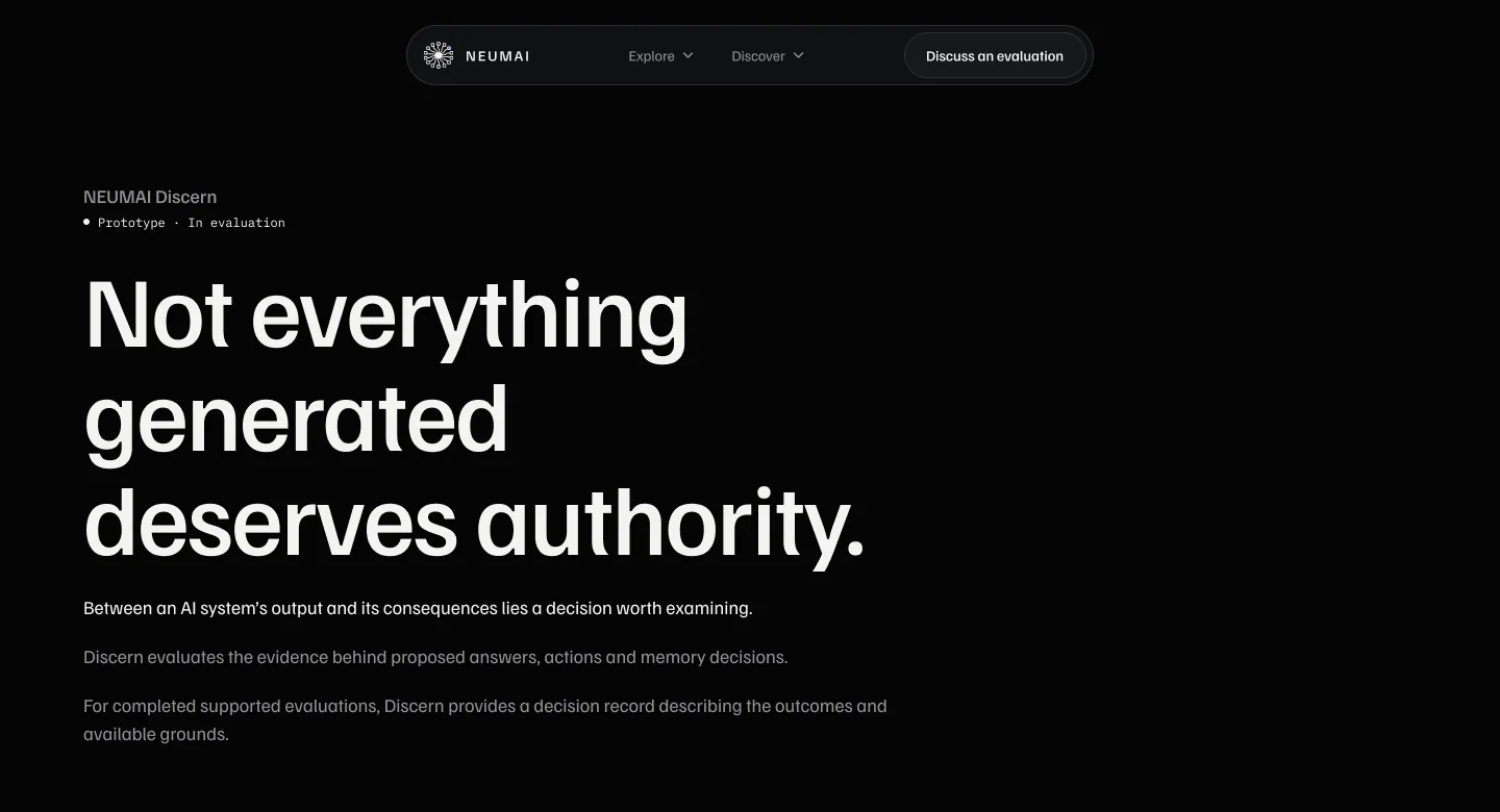
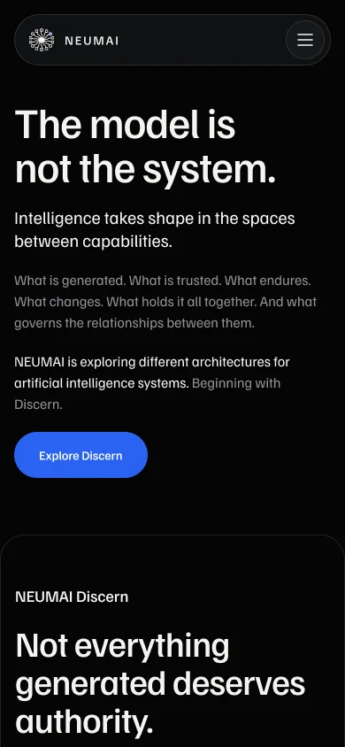
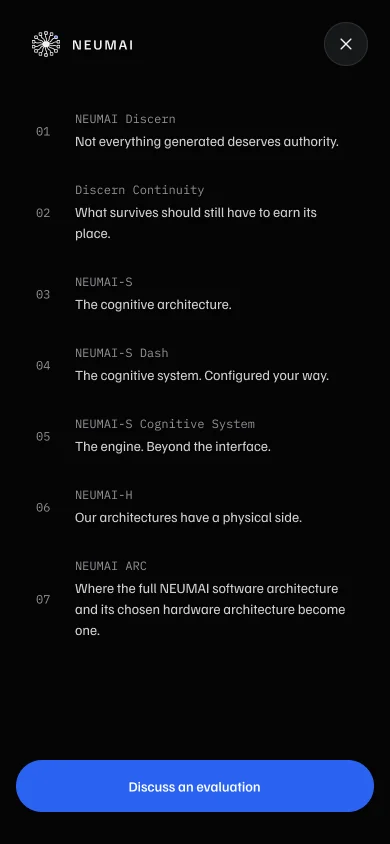
Two menus on desktop: Explore lists the products, Discover the research. On phones they collapse into one full-screen list in the same order, ending with the one call to action. Every product page opens the same way: its name, its status, one line and a short explanation.
Analytics is optional, so declining had to be as easy as accepting. Accept and reject carry equal weight, and the cookie panel can be reopened from the footer at any time.
Built, not just drawn
I built the site in Astro with self-hosted fonts and the same tokens as the design file, then checked it with axe and on real phones before launch. It went live on 10 November 2026.
Analytics stays off until a visitor says yes. On the live site I checked that nothing is sent to Google before consent, and that withdrawing consent deletes the cookies.
What I took from it
Most of the work was taking things out. Every idea that looked impressive on its own and confused people in context went, and the site got clearer each time.
NEUMAI's first product, Discern, has its own case study: Discern: checking before you rely →